What is a Good VISUALIZATION ?
- Summary
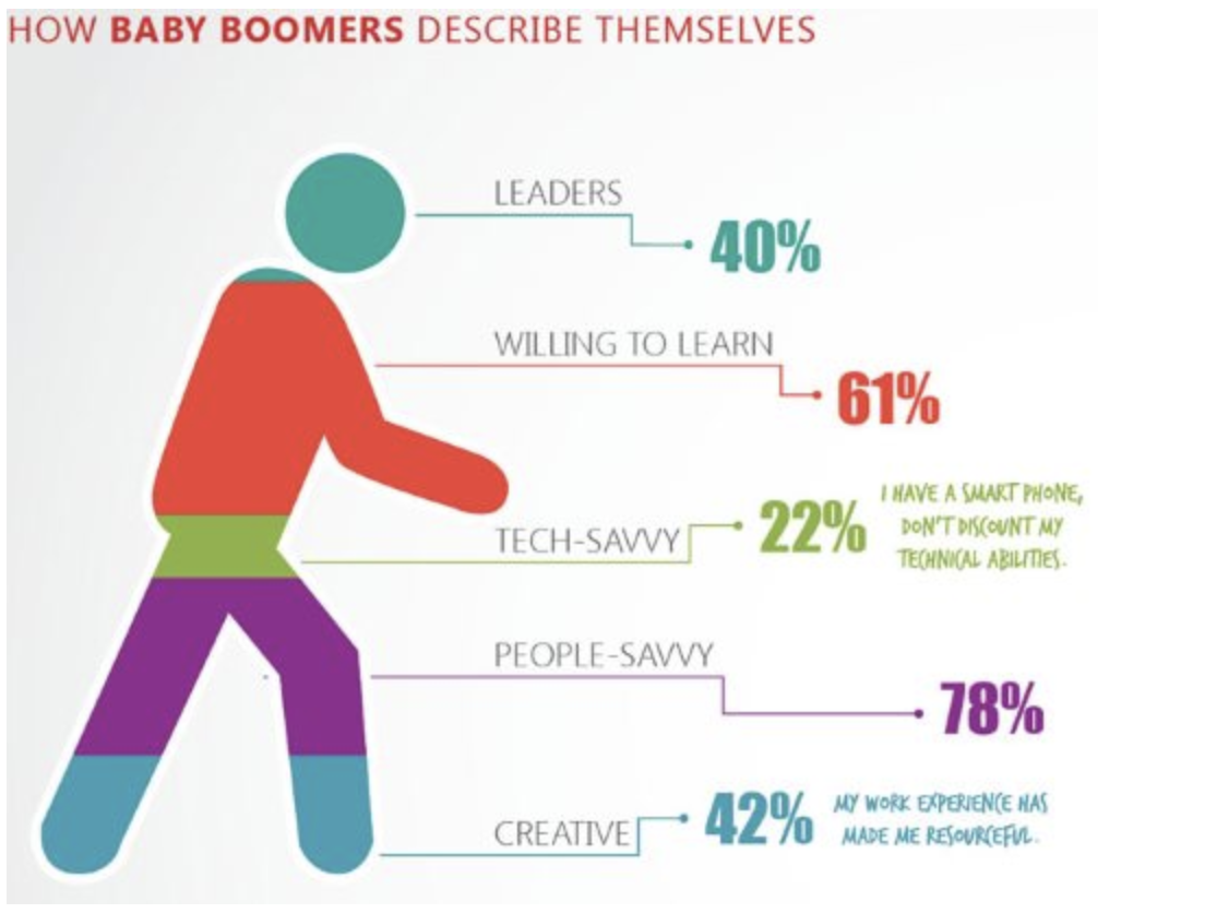
- This is a horrible example of data visualization about how baby boomers describe themselves. There are so many problems, that I don’t know where to begin.
- 1. Reliable Information
- There is no reference around the graph, so the reliability of the data can be questioned.
- 2. Relevant Pattern
- The percentages given do not add up to 100%. Does this mean that the data was incorrectly calculated? Or does it mean that each person was allowed to describe themselves with more than one trait? We will never know. Also, no matter how you look at the color areas of the chart, the area or vertical space of the colors does not seem to correspond with the numbers presented on the right.
- 3. Exploration
- It does provide some labels to describe baby boomers, but it just summarized data. And based on what have discussed before, this visualization is not helpful.
- 4. Attractive Manner
- Having the colors filling up the shape of a person does not help the situation. Because a novel shape will have varying widths from bottom to top. This makes it very hard to know what percentage each color represents.Finally, what is the value for this particular data set of having the shape be a walking person?